
How to Pair Wallpaper with Window Treatments
Do you feel overwhelmed when trying to coordinate home decor elements? We completely understand, particularly when homeowners come to us for help coordinating design elements like wallpaper, window treatments, drapery, and fabric. It’s easy to get lost in the details; we often see frustrated homeowners trying to figure out why nothing is working.
Our designers at Alexander Blank Fabrics & Design cut through that confusion through our design consulting services by focusing first on a few simple choices about pattern, scale, color, texture, and light.
And once those elements fall into place, you’ll see how beautifully every interior design finish comes together.
Understanding Interior Decor Elements
Before you compare a single sample, it helps understand how each design element balances against one another. Wallpaper and window treatments are usually the two largest surfaces of pattern and color in a room, and they sit alongside each other, so when a pairing feels off, it almost always comes down to one of five factors:
- Pattern: The design itself, whether floral, geometric, striped, or solid.
- Texture: How a surface feels and reflects light, from coarse grasscloth and linen to plush velvet and smooth gloss.
- Color: The palette of complement ary and contrasting hues and shades in the design.
- Scale: The size of the design, compared with the room and the other patterns or textures in it.
- Light: How much light and shade each room sees and it shifts colors through the day.
Whether you’re starting with one of the
wallpapers and wall coverings in our showroom or a
fabric you already love, the sections below follow the order our designers usually work in.
How to Pair Wallpaper With Window Treatments by Varying Pattern Scale
Two patterns of the same size tend to clash — picture wide-striped drapery next to a large paisley-pattern wallpaper. That’s why we vary the scale between walls and windows. A large botanical wallpaper, for example, would better suit drapery in a small geometric or a fine stripe. The reverse works just as well, as a tiny wallpaper motif leaves plenty of room for a bold, oversized print at the window.
Or Build The Design Around One Lead Pattern
When the wallpaper takes the lead role in a room, the window treatment fabrics should step back with quieter prints, tone-on-tone weaves, or solids. If you want a dramatic drapery fabric to grab the spotlight instead, the walls then call for a soft texture or muted pattern so the eye knows where to land.
How to Pair Wallpaper With Drapery Through Color
Most wallpapers already have a ready-made color palette. Rather than matching the boldest shade, designers often pull a secondary color for the drapery, which creates a nice contrast and ties the room together. One example would be navy-and-cream wallpaper with small flecks of rust, with rust velvet panels that echo the print without copying it. If you’re unsure which color to pull, bring a wallpaper sample to our showroom or browse our selection, and we’ll hold fabrics against your sample until one works.
Layer Texture on an Accent Wall With Drapery
When a room can only handle so much pattern, you can use texture to its benefit. Grasscloth and linen drapery are an easy match, since both have that relaxed, natural look. Glossy or smooth papers lean the other way and need a cozier counterpoint, like velvet or chenille, to warm them up. That mix of shine and softness gives the eye something to enjoy without adding more prints.
How to Style a Window on an Accent Wall With Drapery
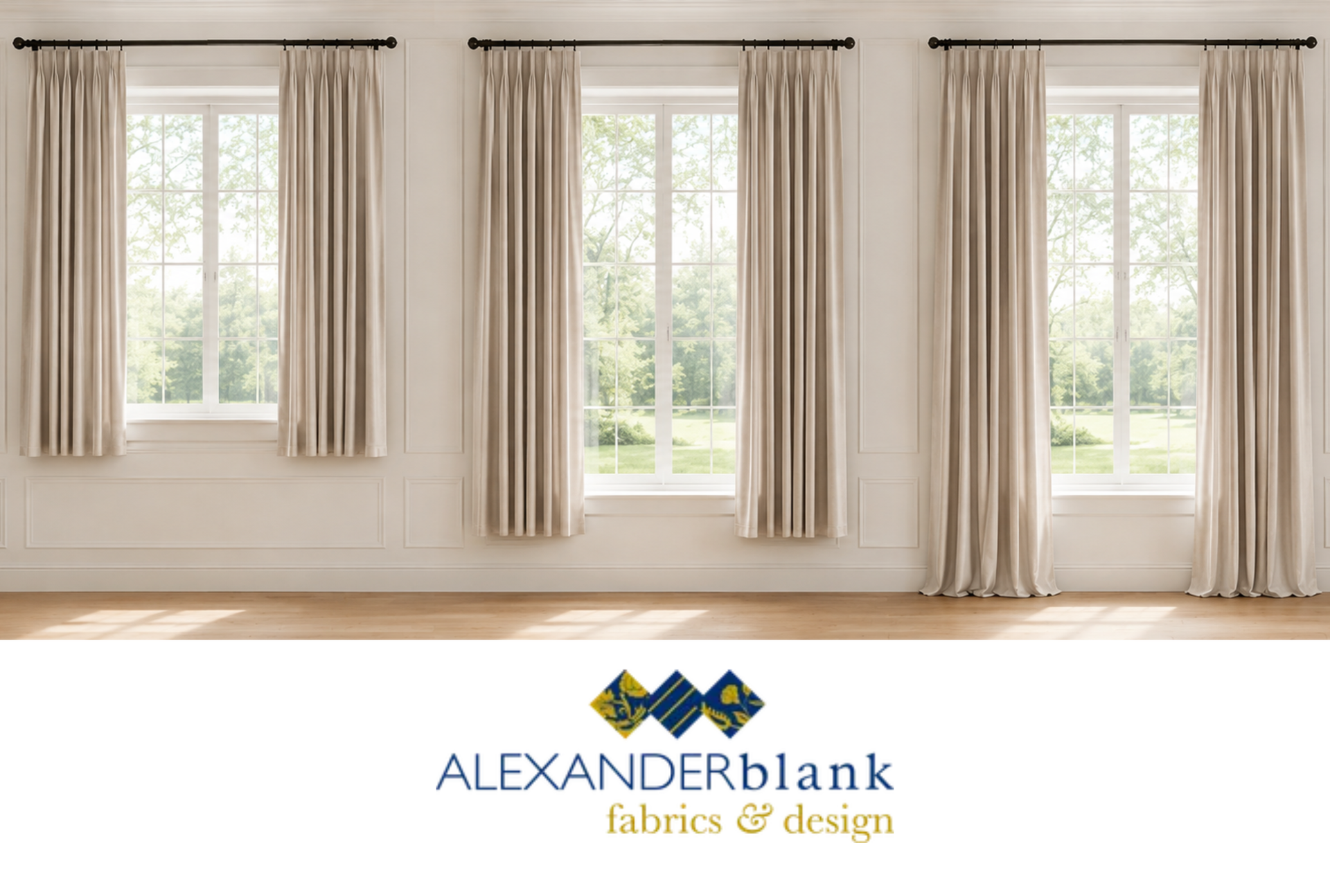
On an accent wall, drapery has two jobs: framing the window and complementing the painted or wallpaper-covered accent wall. Since the panels will hang over part of the wall, we recommend slimmer, stationary ones that cover less of the wall while still softening the window’s sides. Hems that just brush the floor suit this setup well, adding a clean, tailored finish that keeps the look polished without pulling too much focus from the wall.
SIDE NOTE: HOW NATURAL LIGHT CHANGES AN ACCENT WALL WITH DRAPERY
Sunlight shifts how wallpaper and fabrics on elements like bedding and window treatments look throughout the day: Light coming in through south-facing windows can wash out pale colors, while north light tends to make cool tones feel flat. Checking samples together, right beside the window and at a few different times, gives the truest preview of how the colors will look.
Pair Wallpaper With Window Treatments Like Honeycomb Shades
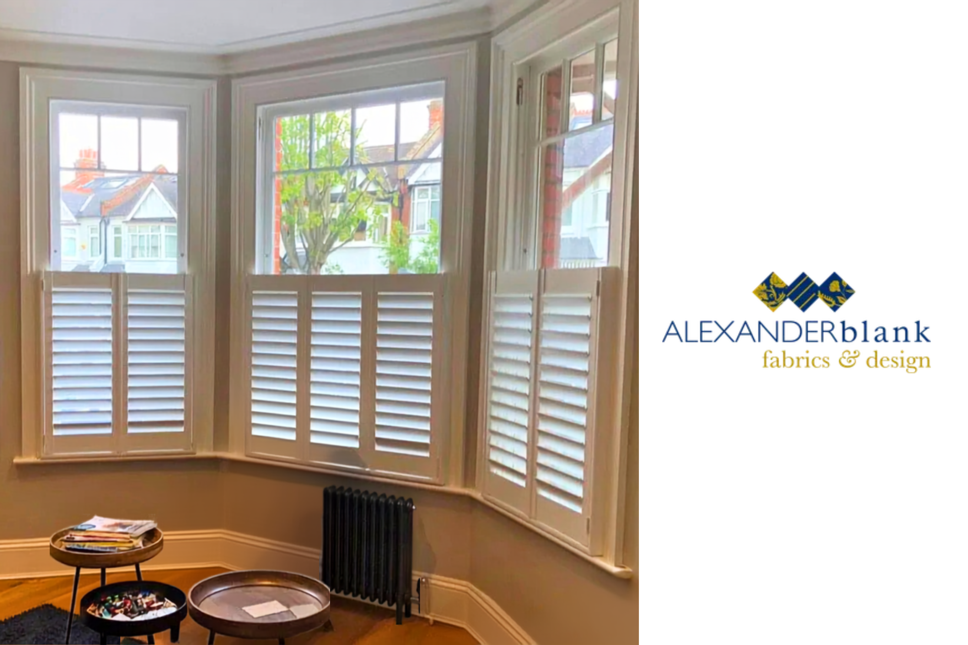
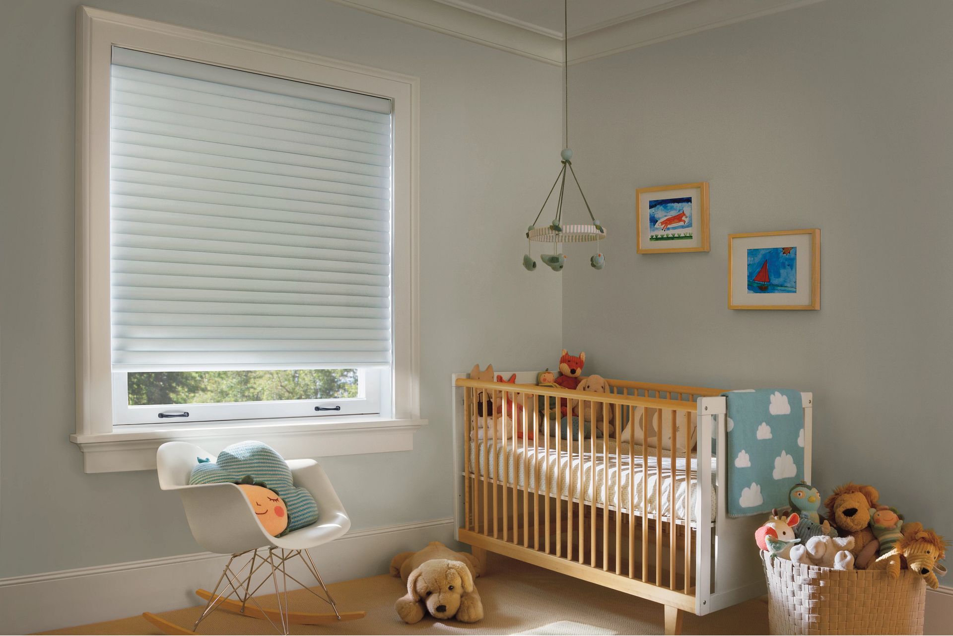
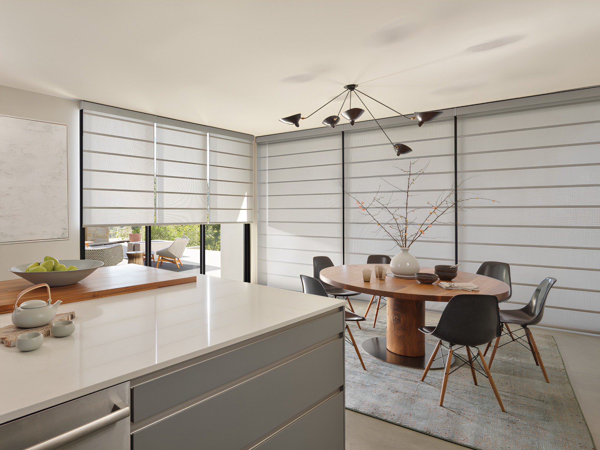
Busy wallpaper usually calls for a quieter window, and tailored shades give the eye a place to rest. Honeycomb shades work well because their smooth, simple fabric lets the wallpaper stay the focus. Another choice, Roman shades, adds soft folds without fighting a print, while woven wood shades bring in natural texture for earthy patterns. For a lighter touch, sheers filter sunlight and can even out the wallpaper’s colors. Our custom shades page compares each style side by side.
Finish Window Treatments With Drapery Hardware and Trim
These small details form the final connection between wall and window. There are many ways to do this, such as:
- Rods, finials, and tiebacks in brass or matte black can echo a wallpaper's metallic accents.
- Tape trim along the leading edge of a panel repeats a wallpaper color in a tailored, low-key way.
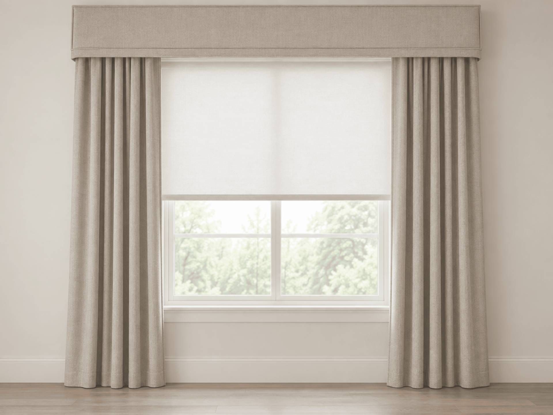
- A fabric-covered cornice or custom valance can draw pattern or color across the top of the window.
Those and other designer touches add polish without introducing another pattern.
Plan Your Design Like a Pro at Alexander Blank Fabrics & Design
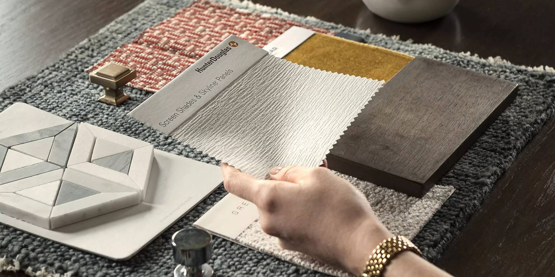
Wallpaper and window treatments look their best when planned as a set. In our showroom, you can lay wallpaper books from makers like Schumacher, Thibaut, and Kravet beside thousands of fabrics and Hunter Douglas samples, so you see the pairing before you commit. Our designers will help you coordinate pattern, color, and texture for magazine-spread-worthy results. Visit our showroom or contact us for a consultation at our location in Lutherville. We proudly serve the greater Baltimore Metro area.